
MY PORTFOLIO
This is my portfolio. Here you can look at my work and see the work I did to make it. And if you like it you can stay a while!
Cliffs of Blue
COLOR VALUE PROJECT
August 30th - September 24th, 2024


This piece features a sun with rays, a cliff with trees, and an ocean. The entire painting was made with different hues and shades of one color of blue. I used multiple values for this piece to achieve a gradient look throughout the painting. I used a hard, opened bristle brush to create texture and a stippling effect on the tree leaves. The goal behind the work was to create a piece showcasing the ever-changing world around us. The opposite effect I chose to make on the rays of the sun shows the contradictions of nature, adding to the surreal look of the painting. In the creation of this painting, I was able to learn the importance of color matching, and I was also able to see the importance of planning. Throughout this painting, there were a few aspects I couldn't quite perfect due to a lack of in-depth planning.
The Phoenix
SMOKE PAINTING PROJECT
October 22, 2024

This piece features a Phoenix surrounded by smoke in the center of the piece. To make the piece I used a candle and the smoke that was produced on the paper. I used the smoke to make a slightly abstract design, and from that, I used a paintbrush to remove some of the ash on the paper and began to create my desired look. To make the Phoenix, I used watercolor and a pen to create an illusion of the wings and the mythical bird's body. My goal with this was to experiment with smoke and learn how to manipulate it for future projects. Although I would change some things like the bird's proportions and how I went about coloring it I would say that the mission of learning how to use this technique was acquired.
Slithers
INK BLOWING PROJECT
October 22, 2024

This piece features a snake in the center of the painting. To make this piece I used watercolors and diluted them with water, by doing this I was able to manipulate the water aspect and make a splated effect using a straw. On top of this, I used a pen to create the drawing of the snake on top of the watercolor. By flowing the movement made by the watercolor I was able to maneuver my snake around it creating an abstract yet constrained piece. My goal with this project was similar to that of "The Phoenix"; I wanted to experiment with the concept of ink blowing and create a piece with the tranquil. I think that in the future I could dilute the water a bit more in order to have more control of the water movement because I found that often the water would stay in one place.

Nostalgia
PAPER MARBLING PROJECT
October 14, 2024
This piece is a bit abstract, I used the colors yellow, red, green, and blue and used a marbling effect on the paper. By creating a design on the water with paint I was able to move the water and thus the paint to create different kinds of patterns. Afterward, I dipped the paper into the water and produced this image. The goal of this piece similar to "Slithers" and "The Phoenix" was to experiment with paper marbling and learn different ways to use techniques in art. In the future, I might work on persevering the detail in the piece by not moving the water too much.
Purgatory
DREAMS AND NIGHTMARES
September 2nd - December 3rd, 2024


This piece features a girl falling into a space-like area with red, white, and black. The process of creating this project was difficult as to create the background I had to do a paint pour. I've never done paint pour before so it took a lot of trial and error to create a background that I really liked. The area the person is falling into is meant to represent purgatory and the purpose of the girl falling is meant to symbolize the fear of not having control over your future anymore. Purgatory is essentially a place between heaven and hell, the place you go when you've not led a good enough life to get into heaven but not a bad enough life to get into hell. For me, Purgatory is a place where you are left to mourn your poor decisions so the girl in the painting falling represents my fear of falling from grace. I'm proud of the detailing on the girl's dress, skin, and hair. I think that I could have made a more visually complex painting as I feel the girl gets lost in the background so in the future I think I will upgrade the painting by showing multiple people feeling the weight of their decisions and falling with the girl.
R17
ANYTHING BUT A CANVAS
December 5th - December 22nd, 2024

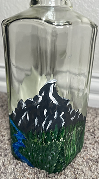


This piece was painted on a whiskey bottle for my father. It features a mountain range with a river and trees. Creating this was a bit difficult because I was under a time crunch and I think some of the painting techniques I used should have been more planned out. To make the trees I used a stippling technique similar to what I used on the trees in "Clifs of Blue" but I think the placing of color should have been more intentional so that the trees could have a more realistic look to them. Similarly, the mountains look very base level because of the issue I felt in achieving depth in the mountain's features. I decided to paint this bottle because my dad is set on making his Whiskey brand, so the design's point was to achieve a similar vision to what he wanted his bottle to look like. In the future, I think working on details like depth perception and true-to-life shading could elevate my painting but overall I am quite proud of what I was able to achieve.

Ink
BUBBLE ART PROJECT
January 8th, 2025
This piece was created by using a bubble art technique in the colors yellow, black, and blue. The piece features an octopus drawn in pen over the top of the bubble art. I liked this technique because I feel that the colors pop and the cool pattern that the bubbles create on the page is unique. I think In the future when drawing over this with a watercolor consistency I will use lighter strokes of my pencil so that when I go over it with a pen the work pops off of the page. Over all, I think this was a really good experiment and I am glad that I got to work on this project and try out different background techniques.
Brooks
WATERCOLOR PAINTING PROJECT
Febuary 10 - Febuary 21, 2025
This piece was made using watercolor to create the bear and the background within the rectangle. The remainder of the piece was made with ink. I really enjoyed this technique because I felt like I could be very creative when it came to using the pen to create details in the scene. To make the scenery I used a bunch of different techniques but I focused on stippling. I feel that using the method of stippling was helpful for me to create a very detailed background. Overall I am very happy with the product of this piece, I put a lot of effort into making sure that the fur of the bear looked intricate, and that the ink background blended well with the watercolor and I think it did exactly that.

The Wild
CUBISM PROJECT
March 10 - May 16, 2025

This piece is acrylic and features a tiger and an alligator fighting each other. To make the piece cubist, I repeated parts of the animal, and I took out pieces as well as added them to the bodies of the animals. The thought behind the piece was to showcase the animistic side of nature, that it can be scary and brutal, but also beautiful. I really enjoyed my work on the project, although it was a little difficult to make the lines straight on a time crunch. Throughout the project, there were a lot of little details, such as the shading and stripes on the tiger, and the pattern on the alligator, that made the project quite time-consuming. I think if I had put a bit more work into the background design, then the piece could have been a bit cooler, but if I could change anything, I would change the technique I put into the scales a lot earlier in the process of painting.